Essential Graphic Design Tips to Elevate Your Creative Projects
- karstjodie
- Sep 4, 2025
- 4 min read
Graphic design is a vital skill in our visually-focused world. Whether you're an experienced designer or just starting out, mastering the basics can elevate your work significantly. In this post, we'll explore practical graphic design tips to help you create eye-catching visuals that engage your audience and effectively deliver your message.
Understand the Basics of Design Principles
Before you dive into more advanced techniques, it's important to understand the fundamental principles of design, including balance, contrast, alignment, repetition, and proximity.
Balance: This refers to how visual weight is distributed in a design. For instance, a symmetrical layout can evoke a sense of stability, while an asymmetrical one can create excitement. Research shows that well-balanced designs are perceived as more appealing by 89% of viewers.
Contrast: By using opposing colors or shapes, you can emphasize important elements. For example, a bright yellow icon against a dark blue background can instantly grab attention, increasing visibility by up to 70%.
Alignment: Proper alignment connects elements and fosters organization. A properly aligned design can increase communication effectiveness by up to 30%, as viewers can navigate information more intuitively.
Repetition: Repeated visual elements like colors, shapes, or fonts can tighten your design’s overall appearance. Starbucks effectively uses green and white in its branding across various mediums, resulting in a cohesive visual identity.
Proximity: This principle involves placing related items close together, which enhances information organization and overall readability. A study showed that designs utilizing proximity improve comprehension rates by 60%.
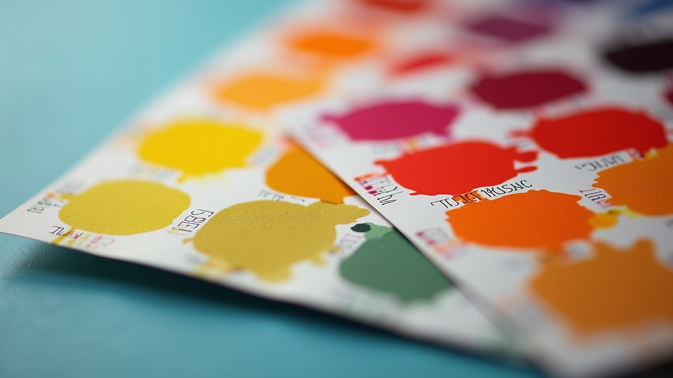
Choose the Right Color Palette
Color is a powerful aspect of design. It can invoke emotions, convey messages, and create harmony. When selecting a color palette, think about the intended mood and message.
For instance, brands like McDonald's use red and yellow because these colors stimulate appetite and attract attention. When creating materials, consider limiting your palette to three or four colors for a cleaner look. Tools such as Adobe Color can help generate complementary schemes.
Understanding color theory can also enhance your work. For example, using complementary colors like blue and orange can create a striking contrast. Statistics indicate that designs using a thoughtful color palette can boost attention span by 80%.
Typography Matters
Typography goes beyond choosing a font; it's about how text is organized and displayed. The right choices can improve readability and set the tone.
When selecting fonts, keep these factors in mind:
Readability: For text-heavy designs, stick to easy-to-read fonts like Arial or Times New Roman. Studies show that readers can grasp information 30% faster with clear typography.
Hierarchy: Use varying font sizes and weights to establish visual hierarchy, guiding the viewer’s eye. For example, headlines might use a bold sans-serif font while body text uses an easy-to-read serif font.
Pairing: Combine different types of fonts skillfully. For example, pairing a crisp sans-serif headline with an elegant serif body can add visual interest without overwhelming the viewer.
Consistency: Limit your font choices to just two or three throughout any project to maintain unity and professionalism.
Utilize White Space Effectively
White space, or negative space, is your ally in creating balance and enhancing readability.
Using white space effectively can help to:
Highlight key elements.
Create elegance in design.
Improve the overall flow of information.
For example, Apple uses white space largely in its product advertising, allowing their products to stand out superbly. Research indicates that effective use of white space can enhance readability by as much as 45%.
Incorporate Visual Hierarchy
Visual hierarchy signifies the importance of elements, guiding the viewer’s attention. Arranging components thoughtfully affects clarity and engagement.
Consider enhancing hierarchy by focusing on:
Size: Larger items draw the most attention. For instance, larger call-to-action buttons can increase click-through rates by 90%.
Color: Bright or contrasting hues can emphasize vital information. A vivid red can make essential points pop.
Position: Elements placed at the top or center are often noticed first. Designing your layout with these factors in mind can greatly enhance viewer experience.
Experiment with Layouts
Layouts serve as the framework of any graphic design project. Trying different layouts can result in unique and engaging designs.
Utilizing grid systems can help maintain structure and consistency, promoting clarity. For example, Instagram employs a grid layout to maintain a unified visual aesthetic across its platform.
However, feel free to step outside traditional frameworks to create standout designs. Creative deviations can capture attention and increase the likelihood of shares and engagement.
Use High-Quality Images
Images can greatly enhance design, but poor-quality visuals can undermine your work. Always opt for high-resolution images relevant to your theme.
When selecting images, consider:
Relevance: Ensure images enhance your message. For example, using a picture of healthy food for a nutrition article reinforces the topic effectively.
Style: Images should match the aesthetic of your design for a unified look.
Licensing: Always use properly licensed images or your own to avoid legal issues. High-quality visuals can increase viewer engagement rates by 70%.
Seek Feedback and Iterate
Feedback is essential to the design process. Sharing your work can provide fresh perspectives and constructive criticism.
Join design communities or forums to share your projects and receive valuable input. Embracing feedback can lead to refinements that enhance your final product, potentially doubling its effectiveness.
Iterating on your designs fosters continuous improvement. As you refine your work based on feedback, you will likely notice significant enhancements in both response and satisfaction rates.
Stay Updated with Design Trends
Graphic design is an ever-evolving field. Keeping up with the latest trends can inspire your work and keep your designs fresh.
Follow design blogs, attend workshops, and connect with fellow designers. However, while remaining aware of trends is important, ensure your designs reflect your unique style. Studies show that authentic designs enjoy a 25% higher retention rate among audiences.
Wrap-Up: The Path to Stunning Design
Graphic design is a powerful tool for communication and expression. By grasping fundamental principles, experimenting with layouts, and being open to feedback, you can elevate your projects like never before.
Keep learning and adapting as design trends evolve. With regular practice and dedication, you can create stunning visuals that resonate deeply with your audience.


Comments